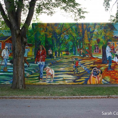
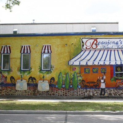
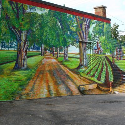
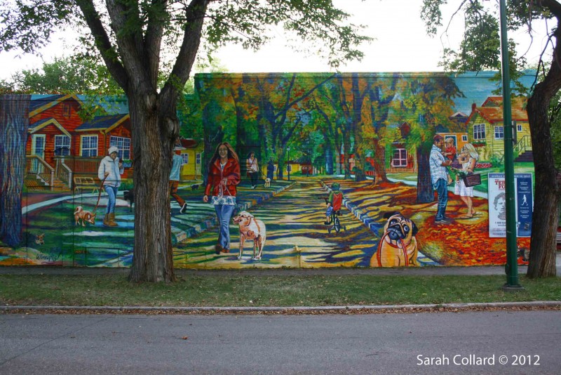
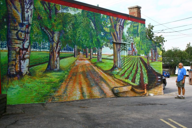
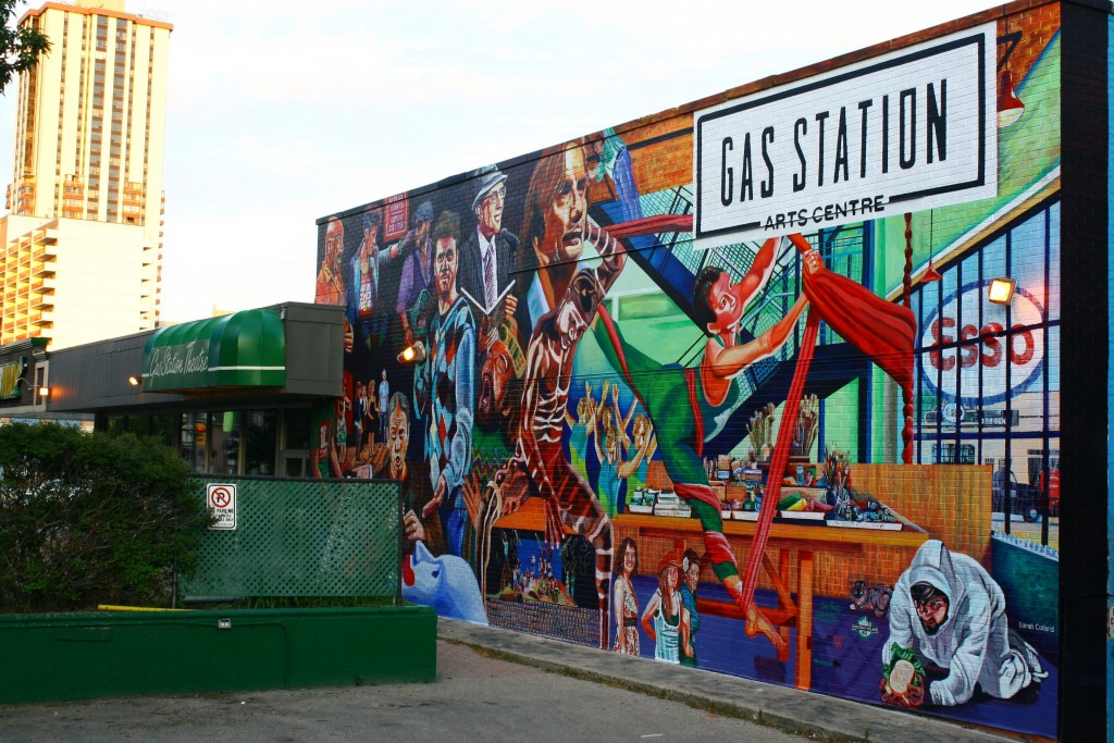
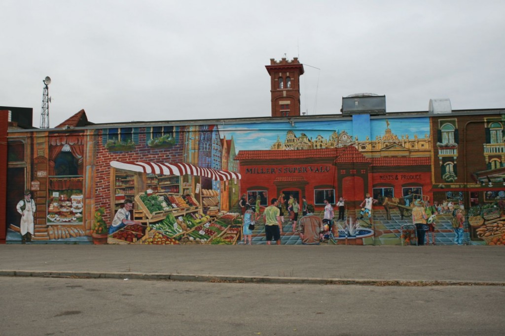
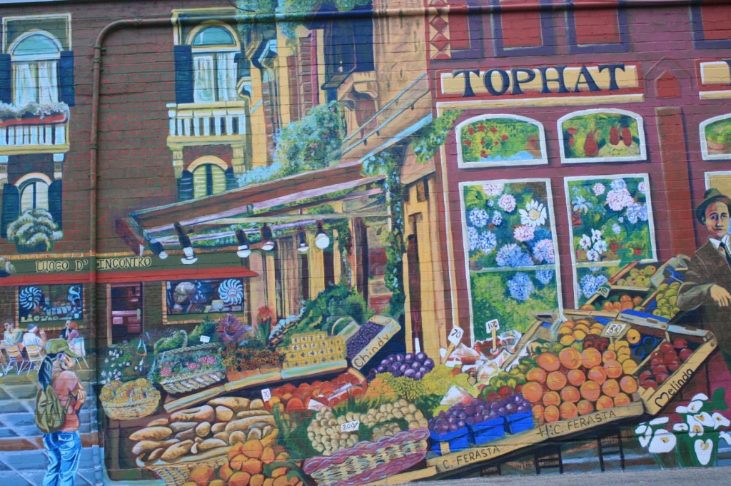
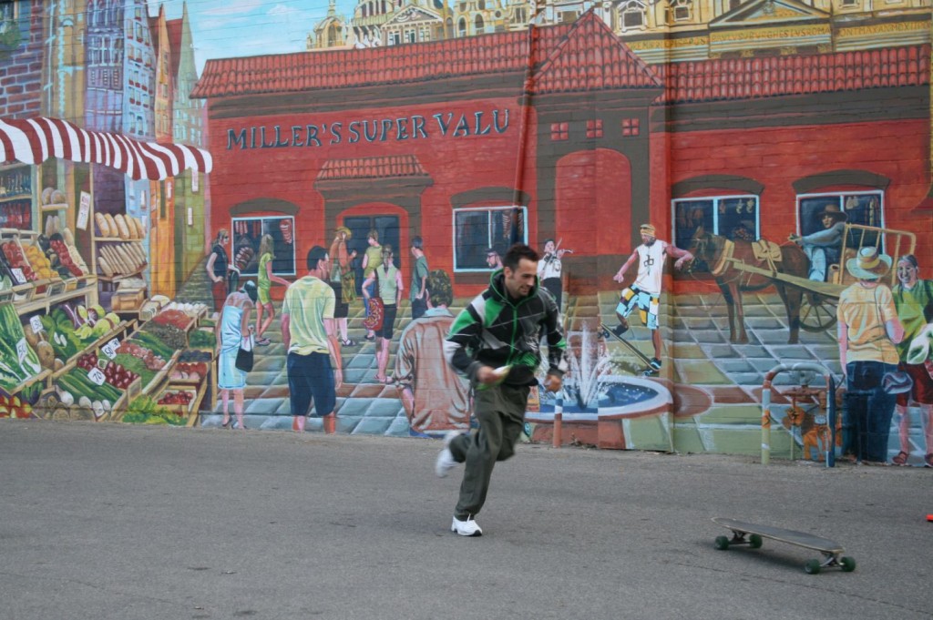
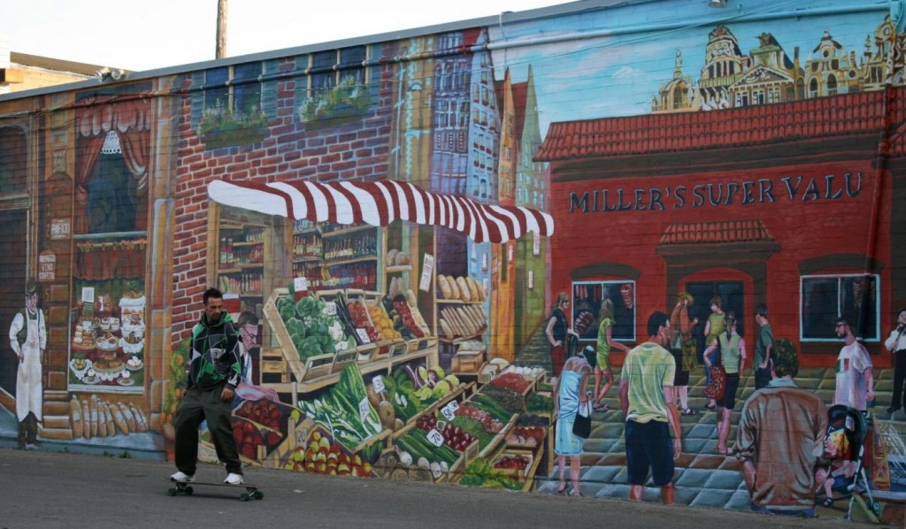
Walk Through the Seasons, (Kit-Kat) Bestway Foods, Great Licks Ice Cream, 21’ x 45’, 967 Wolseley and Ruby Street, Winnipeg, MB, 2012, latex on brick
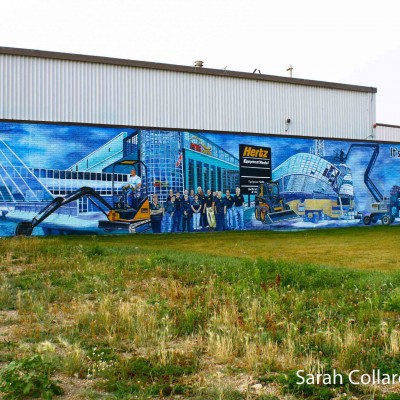
Sponsors: Take Pride Winnipeg, Hertz Equipment Rentals, Paterson Foundation
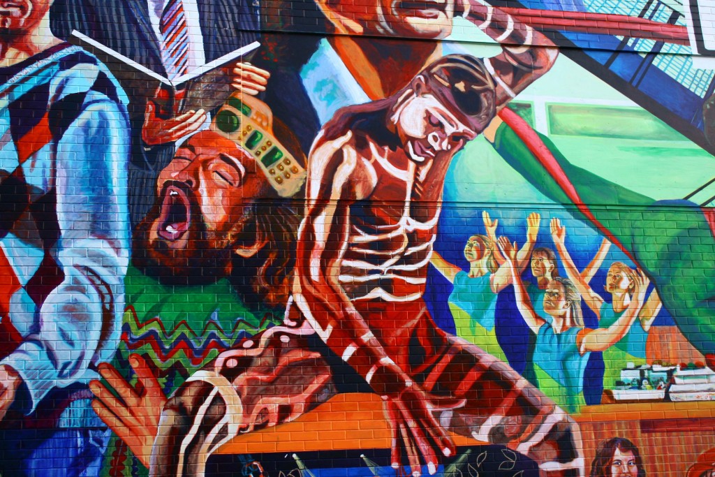
Walk Through the Seasons is often a difficult but necessary task when dealing with the loss of a loved one, divorce, separation, relocation, or any number of life changing experiences. This Mural is meant to brighten the neighborhood with its pure colours and also reflect the environment in which so many Wolseley residents live. Often one will see people walking their dogs or going for a walk down the lovely treed area, lined with quaint, older homes. The suggestion is to take the dogs lead, grab the leash and increase this healthy habit by walking your dog, through the seasons, through the spring, summer, fall even winter. The colours range from springtime cool colours such as blue and green to autumn orange, yellow and red. There are a variety of individuals featured in the Mural, from children, students to middle aged. All are found on the streets or sidewalks, cycling or just hanging out.
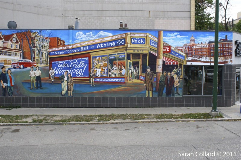
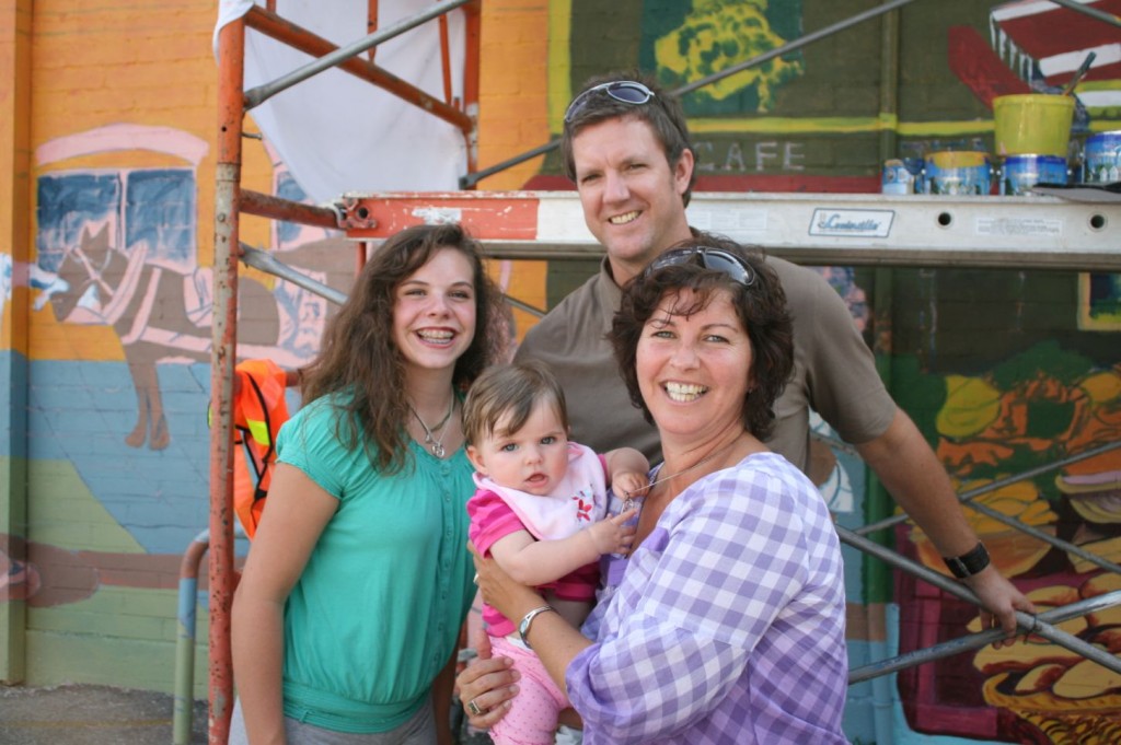
When I was working on this design last summer, I took photographs of infamous Garfield Street and the streets beside it including Sherburn Street. The original idea was to have recycling boxes lining the streets, promoting the city’s goal of increasing the amount of recycled goods per capita. Soon, the city introduced the tall recycling boxes and distributed them to all households. One of my friends visiting from Florida (Ben) modeled for me, lifting recycled boxes, stacking them and dropping milk jugs into the bins. This may have messed up people’s back lanes but it was great to have a model who looked both aboriginal and white loading and unloading these full recycling boxes. I never did use him in the mural but when it came time to paint the central female figure I tried to make her look like him (but it did not work). The reflections made me think of Terry Farrell, a senior artist who lived in Swan River at one time and whose work I admired. His paintings were always bright and brilliant, using yellow as a base and majoring on reflections, much like the Group of Seven. Dale Wiebach in Swan River would understand because she introduced his work to me. The family on the right is my cousin Rebecca Collard-Paulin and her husband Allan Paulin and their two young children. They just had their photographs taken by Hula Hoop Photography so I borrowed this great shot of them interacting. The house on the left is located at 49 Sherburn St. South, Winnipeg but I changed the colours to reflect our very first home in Swan River, Manitoba. It looked like a Christmas house with a red brick base, a green roof and golden trim which brings the colours of the festive season into the Mural. I included a few cats to balance out the animal kingdom, added the owner’s dog.


 restored in 2014