Run into Learning, Ecole Marie Anne Gabouray, 31’ x 100’, 50 Hastings Boulevard (corner of Dakota and St Mary’s Rd), Winnipeg, MB, 2011, latex on cinder block
Sponsor: Take Pride Winnipeg
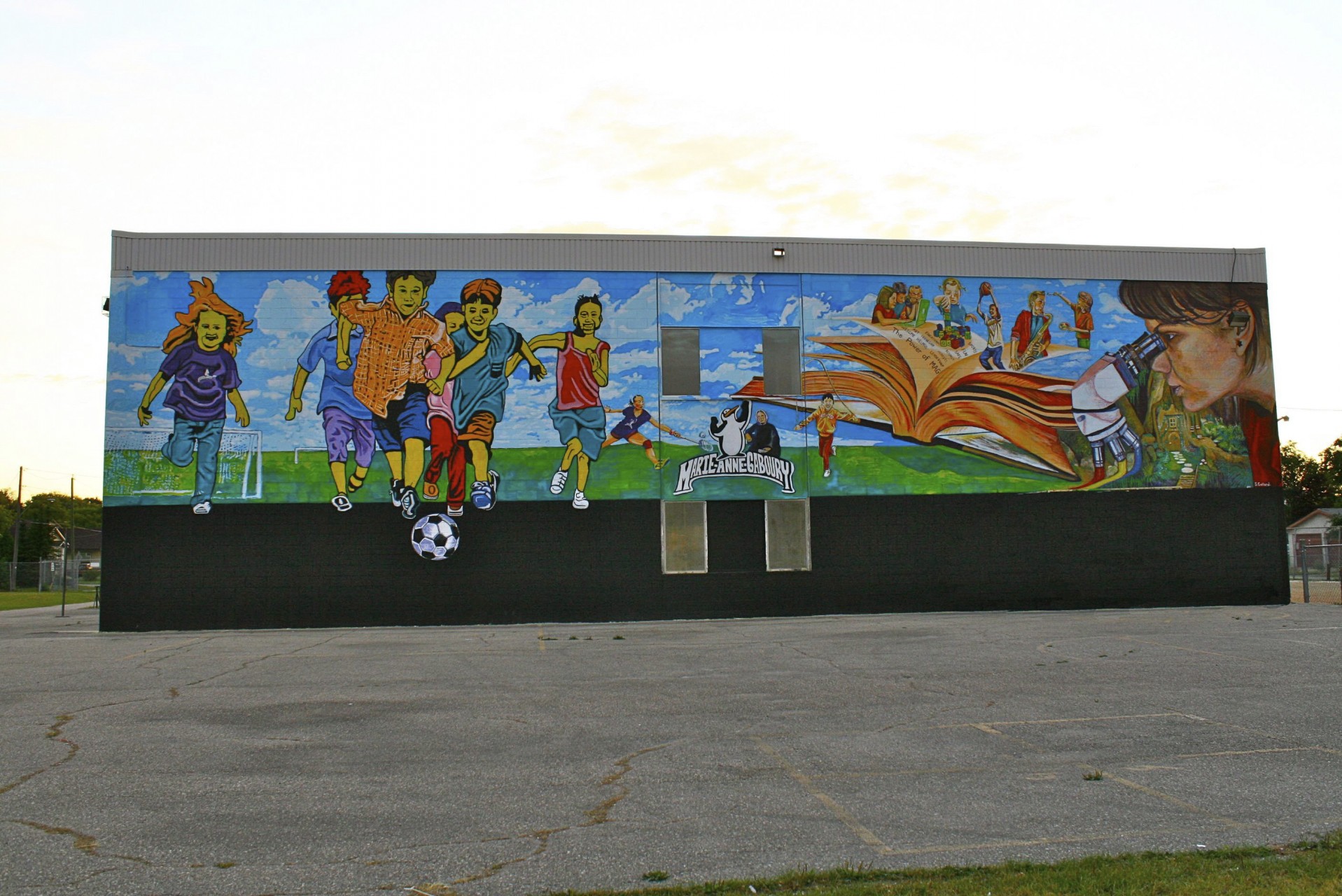
This colourful, vivacious wall is part of the Louis Riel School Divison and is a French immersion school with children learning from grades K-8. It is located in the playground on the upper part of the gym wall below the basketball courts, beside the soccer field and parking lot. Hastings school shares the grounds with Ecole Gabouray and if you are standing in the back of Hastings school, you can get a great view of the mural. Some of the former students of Ecole Marie-Anne Gabouray had painted the wall with a rainbow, the school mascot, parliament building, a bus and teepees but the paint was pealing so it needed to be repainted.
With a change in mascot, the Principal Marc Poirier wanted students to come up with the idea for the mural and include a reference to Louis Riel’s grandmother, Marie-Anne Gabouray. Near the end of the year, some grade 7 and 8 students made a list of words that represented the school; “the power of MAG, respect, safe, fun, sports, educational, leadership, helpful.” A sketch was made of a large book with figures coming out of it. These figures represented the various subjects in the school such as computers, science, math, physical education and some of the activities played on the school yard. The students and principal asked for a mural that would reflect their school beliefs, mainly who they are and what they do. Since the school was a part of the Louis Riel School Division and I previously taught art at George McDowell School, I knew the art curriculum and some of the lessons that Karen Geist, the visual arts consultant had made available to all teachers in the division. A very popular inservice inspired by Norval Morrisseau, an Aboriginal, Woodlands, Canadian artist who paints legends of his people and stories of his Christian beliefs was presented to early years teachers. Students used his characteristic thick, black outlines to create the skeleton of animals and people which were later filled with bright pure colours. The black line was meant to suggest a continuous contour line dividing good from evil or one idea from the next. Even though this school has never had an art specialist, I knew I had to come up with something that was fitting for the school, the students and the division.
“Run into Learning” is an energetic look at some of the activities played on the school grounds and the learning that happens inside the school. Stylistically it suggests Aboriginal paintings or children’s artwork, the imagination of readers and the real life energy of young learners. The soccer field and cloudy sky provides a common background to the composition bringing together the events on the left with the learning on the right. An orange flying book comes to life with every subject from math, language arts, computers, physical education, music to art. A scientific specimen is examined as colours flow from its base, suggesting optics; the basis for colour theory, mixing everything from three primary colours. As the mural progresses so does ones imagination with a fairytale land hiding beneath her chin providing an entrance to another world. The school words are written in the book as a handbook of beliefs. The little girl playing blocks is a reference to the daycare located in the school basement. A portrait of Marie-Anne Gabouray is placed to the right of the new school logo. Two Asian girls were added to give diversity to the kind of activities played on the playground. The children running toward the soccer ball suggest the frequent games played on the field and the energy that many students put into their studies. They have things in common yet are different. The solid black line that shows up so often in Norval Morrisseau’s work and the Woodland Artist’s style indicates an interdependence of relationships. It also breaks up different ideas for example active learning verses traditional learning. The simplicity of colour and line suggests student work which is often bright and brilliant.